I have been painting murals throughout my fine art career which has now spanned just over 30 years. Depicting a scene on the grand scale is like second nature to me, like eating food or breathing. To those who have never painted a mural before, at first it may seem overwhelming, but once you get your feet wet in the process, it really isn't.
THE FIRST STEP
The first step is coming up with a THEME and then find a way arrange it in a pleasing composition. For the Novatek Mural Project, the theme has always been to depict a Wasatch Mountain scene from the Utah County area. PURPOSE is also an important part of the first step in mural creation. In our case, the purpose of this project is to create a mural that is so inspiring, so uplifting that is has a positive influence on those who work in the space daily or come to visit, to conduct business. For us, this is really a tall order and a big responsibility. The wrong colors or mood could contribute to a depressing atmosphere, low morale, etc. It is absolutely important that the final result fulfills the purpose intended.
Yes, sometimes this first step can be nerve racking, but we have been painting murals for a long time and I know from experience to not give up and to have confidence and tenacity in my own ability to give the client what he wants. The sketch for the Mountain Vista mural came much easier than the MC Print building's mural sketch, yet we plowed through all the objections (the MC Print sketch went through about 13 major changes/repaints in a two month period)and we are now much closer to where we need to be. The final result will fulfill the mural's purpose.
STEP TWO - SCALED SKETCH
Making an accurately scaled sketch is important if you're going to enlarge your drawing onto a larger canvas surface or directly on the wall. Creating a sketch to an accurate scale saves a lot of time, making the transfer from small to large much easier. I will often make a drawing or a painting with the scale of one inch representing one foot in full scale. You can also use smaller measurements such a one-half or one-quarter inch equals one foot enlarged.
Next, on the wall or full scaled surface to which my sketch will be transferred, I sometimes make a grid of one foot by one foot squares. I duplicate this grid from top to bottom and left to right, until the whole surface is covered with this grid pattern. If I don't want to draw a grid on my nice sketch, I will create a simplified drawing or rough sketch and grid this to one inch squares. Now it is a simple matter of observing each individual square at a time to see where the basic lines fall in each one foot square on the mural surface. Don't worry about detail yet, which leads us to the next step...
STEP THREE - ABSTRACT SHAPES
The mural composition (arrangement of shapes or patterns balanced with the arrangement of positive and negative space), must first work in it's most simplified, uncluttered form;Abstraction of Shape and Design. LESS IS MORE is a true design principle which means to eliminate the unimportant so that it emphasizes only that which is important. My instructor, Sergei Bongart put it this way, "More important what you leave out than what you put in". Long before abstract form was promoted as an Avant-garde art statement, master artists followed this principle as a foundation for establishing solid design. Before any detail is to be applied to an art form, be it visual, sculptural, musical composition or literally any art form, it has to work in the abstract. In music, the abstract is in the theme and a very basic melodic line. In visual art, the abstract of a pine tree or other objects may be represented as a simple triangle, a cylinder, a square or other simplified geometric shapes.
When I paint at my easel or on a wall, I will sketch out the Abstract Forms with either a piece of charcoal or a paintbrush.
STEP FOUR - FOUNDATION WASH (can be done with oil or water based paints)
Still thinking in basic abstract form, cover the white surface with thinly painted colors that will make for some great under-painting. For example, in this Novatek Mural Project, I first painted the sky which was to become a neutral pale blue clear sky in the MC Print Mural a creamy yellow. Why would I do that? The end result created a softer, more pleasant subtle warm luminosity in which I know of no other way or technique to achieve this effect. If you study the sky on a clear day, the "blue" sky is actually a softer and slightly warmer blue nearer the horizon. The neutral blue tone was painted thinly, by thinning the color with turpentine. This created a semi-transparent effect, allowing the creamy influence of the under-painting to come through. The rest of the painting was quickly washed with appropriate colors as you can follow in some of the pictures provided in the blog.
STEP FIVE - MIDDLE VALUES
Now I start applying paint with less thinner and more opacity. I am still not concerned with detail, but I am concerned with color values. Some artists begin painting by establishing what they first perceived as their lightest light and darkest dark. I don't agree with this method. Too often, you will discover down the road that you limited yourself and have to make major adjustments. It is much easier for me and it makes more sense for me to begin the most serious painting with only the middle values, eventually working toward my darkest dark's and lightest light's as I get near to the finish. Usually, with this approach, the lightest colors are your final accents which you apply in the very last few strokes. This method also seems to create a much more subtle and sensitive range of color harmony.
STEP SIX - COLOR HARMONY
This is the fun part; getting all the colors in middle values to dance together in beautiful harmonious melodious visual music. If the colors don't work well together, it is the same as striking an out-of-harmony chord on the piano. I have a term for a painting with bad color; "VISUAL VOMIT" (My father came up with that one). If the color is off, something makes you feel uncomfortable or uneasy. Sometimes the colors look too muddy, too chalky or raw. What is the cause? It is poor juxtaposition of color (different colors positioned side by side). A particular color which looks muddy, chalky or raw, etc, in one circumstance may be beautiful and harmonious in another, depending on the other colors next to it. When all the colors are working beautifully together in their middle values, then it is time to move on to the next step.
STEP SEVEN - ADDING THE DETAILS
As we begin to apply detail, we first begin by working out the other value ranges. Although we have come this far in the painting, it is still important to remember and keep the previous steps in control. The "less is more" principle is especially important. Only the right amount of detail is enough. Too much detail in my opinion looks to mechanical, too illustrative and strays away from the "true art of the art form". Over modeling of an object also kills color luminosity. One or two simple brushstrokes can represent much detail if the color looks atmospherically correct. Besides, you really cannot actually see every blade of grass or leaf on distant trees, although your mind knows they are there. What you do see is a mass of color, value, pattern and shape. I do not apply every single detail. That is boring to me. Even still. I am considered a realist painter, because I make it feel real, yet with an economy of brushwork.
STEP EIGHT - FINISH
Add the last minute details and the brightest accents then, VOILA! you are finished!
MURAL SPAN LEFT END
We are now down to just the final accents!
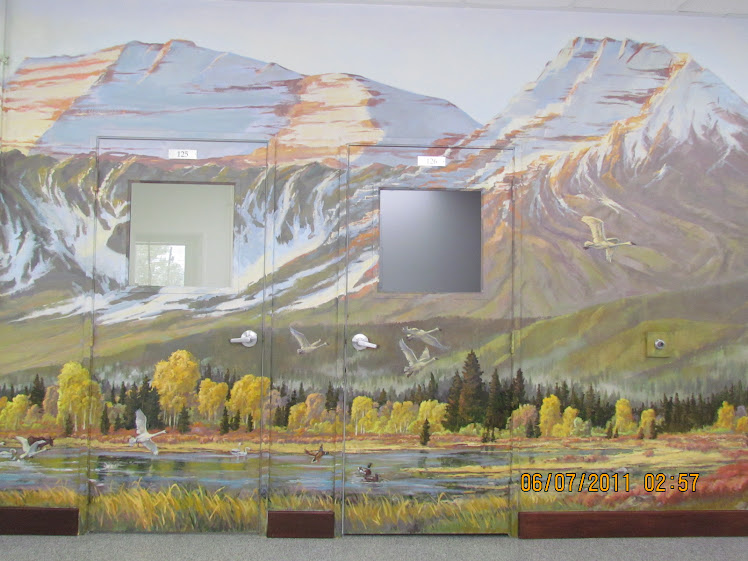
FINISHED MURAL
Today we spent less than 2 hours finishing up by painting in the final accents, touching up and removing all the masking.
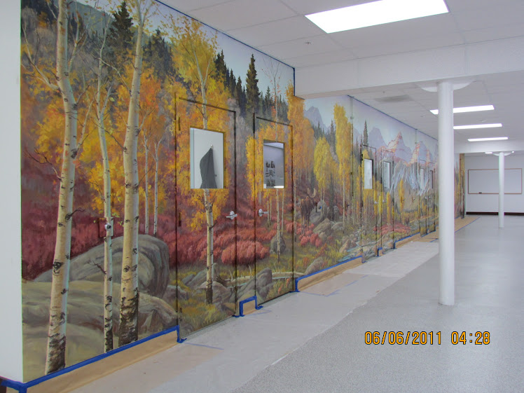
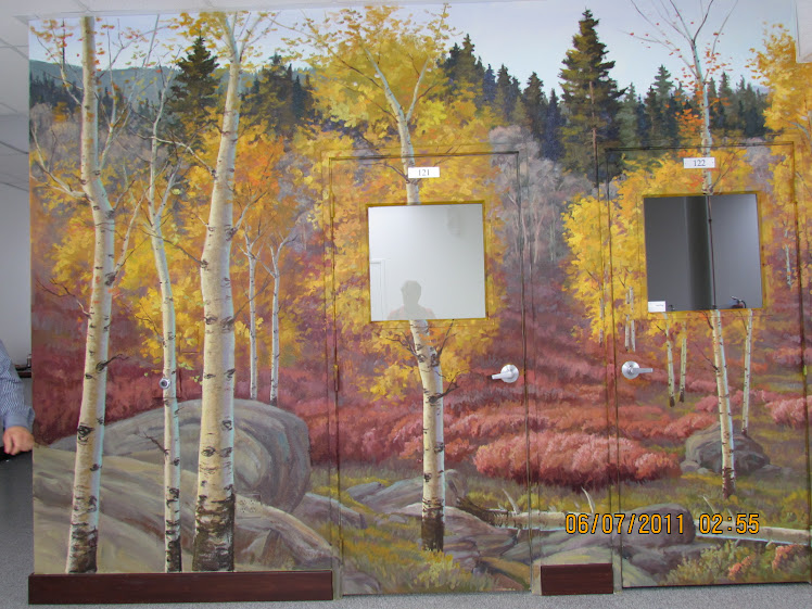
Novatek MC Print Mural
Concept Sketch for MC Print Mural
RUSSELL RICKS IN FRONT OF MC PRINT MURAL
MAY 4, 2011. Rajish, who is originally from India an employee of the company, photographed me in front of the MC Print Mural.
LEFT END, SECOND SECTION.
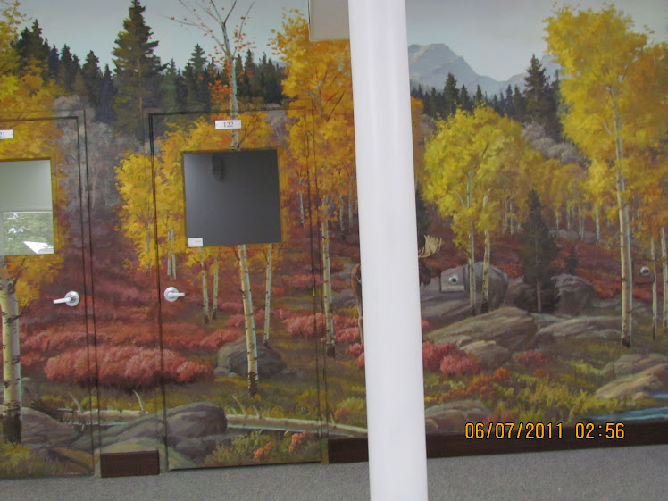
While working on this project, I faced right into this iron pillar many times. The problem is, I get to concentrating on what I am doing that I loose touch with what might be going on around me and it is in those moments keep smashing my face into the pillar
MOOSE, LEFT END
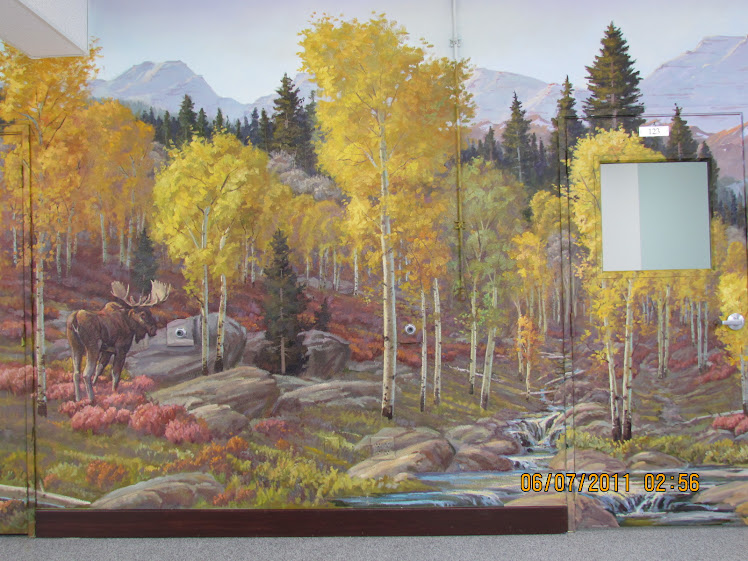
Once we removed the masking, i was very pleased with the end result.
CLOSE UP OF LEFT END MOOSE
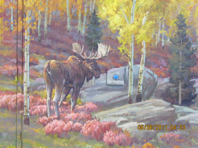
This section has become my favorite part of the mural.
ROBERTS BENCH SECTION
With warmer highlights on the sunlit side of Roberts Bench and a few tweaks here and there, The employees were very pleased with the end result. They like it and that's what counts!
MOOSE AND RESERVOIR SECTION
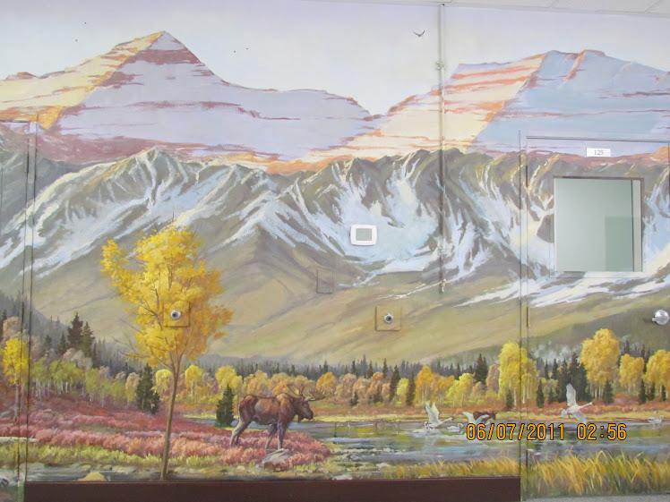
It only took a few minor accents and less than 2 hours to finish up the project.
Close Up Of Moose
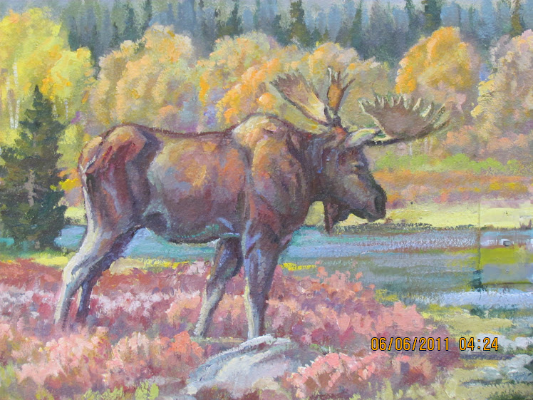
The neck and shoulder area look better.
Other Close Up
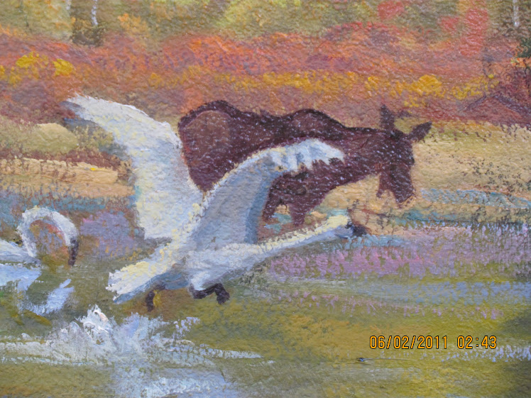
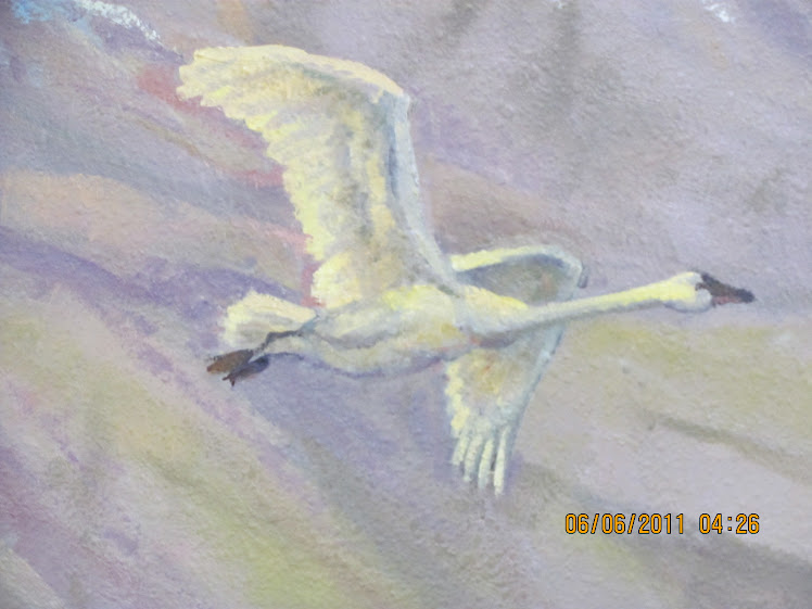
Swans in Lake Area
SWAN SECTION
Swans taking flight.
SWAN CLOSE UP I
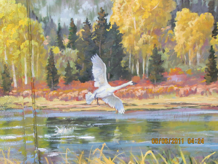
I love to watch these graceful birds in flight.
SWANS II
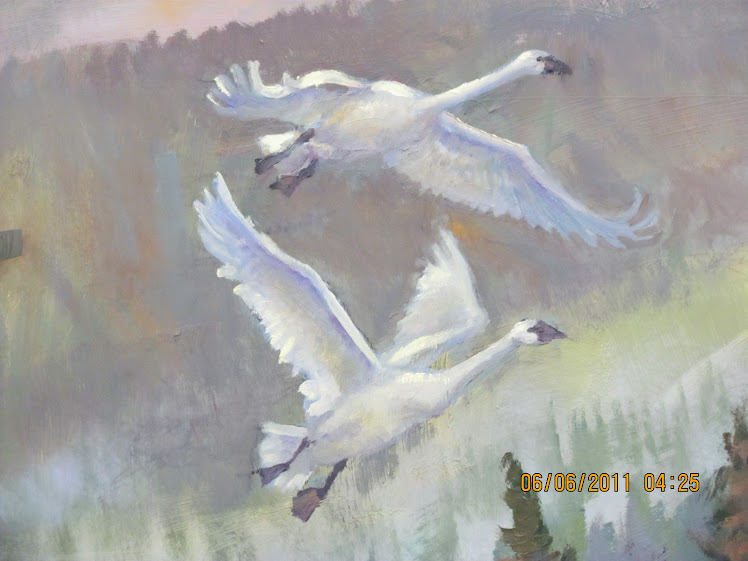
Each swan is in a slightly diffenets stage in flght.
Mallard Duck
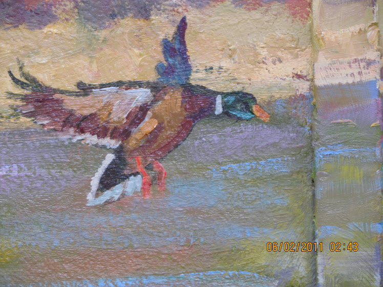
This duck replaces a larger one we had in then took out the other day.
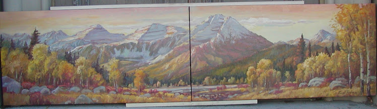
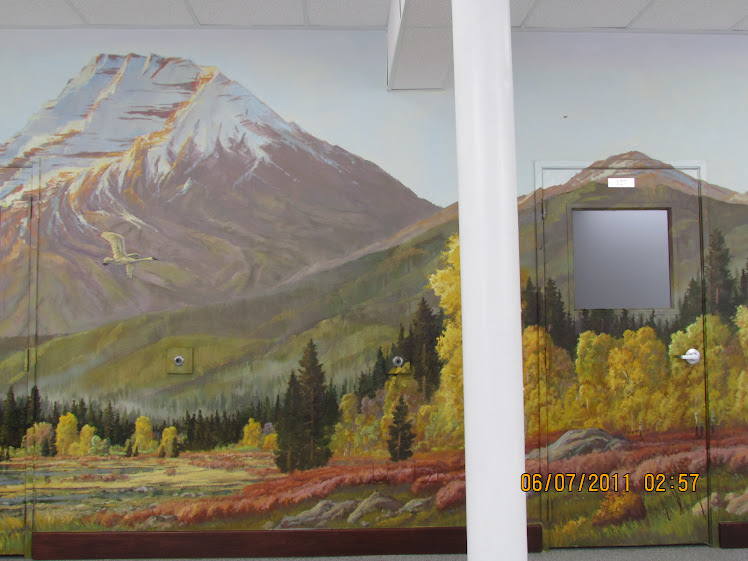
TIMP RANGE FROM THE NORTH END
I love the shape of the mountains viewed in American Fork Canyon.
SWAN III
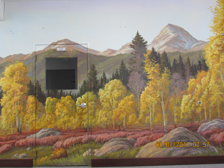
Aspens Right Side
I ran smack-dab and face-first into that iron beam support yesterday. Ouch, that hurt!
Mount Baldy Section
The aspen trees now have more form and are no longer flat and dull looking. Mount Baldy got a little more form and refined patches of snow, giving the granite form more of a 3D look.
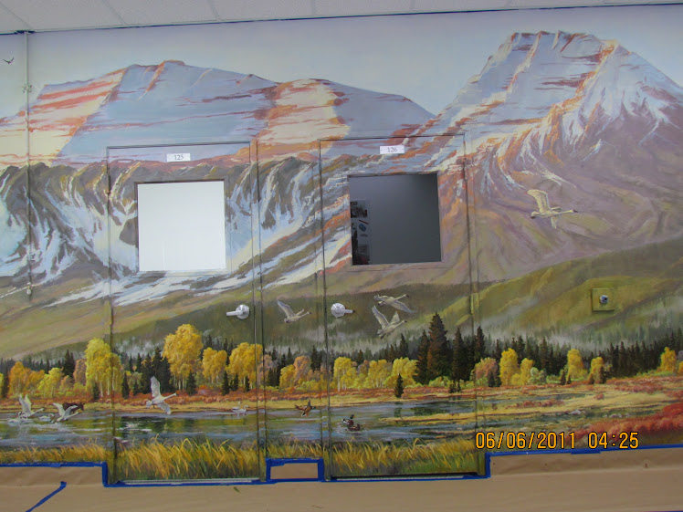
Right End Section
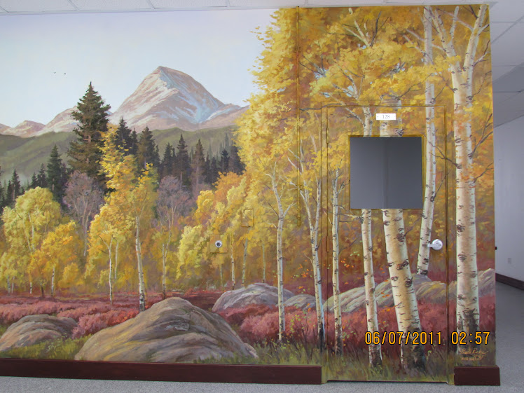
Looks much better without the masking.
MURAL SPAN FROM RIGHT END
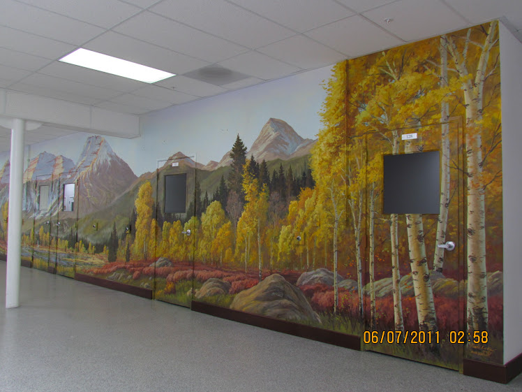
This is the first section everyone sees when they walk in.
Hike to Stewarts Falls
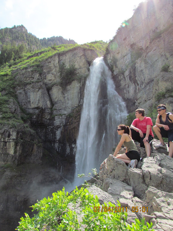
Took a fun hike to a great reward on the 4th of July. Stewarts Falls is in the Timpanogos Range Region.
Sunday, January 30, 2011
Saturday, January 29, 2011
Step 3 in Mural Painting: Middle Values
With all the foundation painting out of the way, we now start on Step 3 in the process: MIDDLE VALUES. This is one of my favorite steps, but the focus is not so much detail. This is when painting really gets fun! The focus is on getting all the MIDDLE VALUES to work together like a beautiful melodic song. When colors or a color is out of harmony with a particular melody created with paint, it looks muddy, chalky, raw, too warm or too cool, etc. It's just like hitting the wrong note on the piano which causes you to cringe! Bad color is Visual Vomit!
Once the color is worked out, then the rest is a matter of refining the color harmony, values from dark to light and adding details. After that, the Final Step: the last few minutes of applying Highlights, which are the Final Accents of the brightest colors.
Once the color is worked out, then the rest is a matter of refining the color harmony, values from dark to light and adding details. After that, the Final Step: the last few minutes of applying Highlights, which are the Final Accents of the brightest colors.
Thursday, January 27, 2011
CHANGES FOR THE BETTER
The MC Print Mural is undergoing substantial changes and the changes look good. We expanded the lake area which reduces the "too much yellow" effect and adds complimentary contrast to the line of autumn trees. To the left of the foreground in the picture plane, we blocked in a mass of rock formations. In the midst of the rocks will be a a little waterfall as it flows over the river rocks and into the reservoir. Eventually, I plan to add a line of low hanging mist at the base of the foothills and behind the mix of trees on the backside of the lake. This will add interest and simplify the large dark foothill area. The project is coming along. I feel very good about the progress.
Wednesday, January 26, 2011
"Blue Skies, Nothing But Blue Skies From Now On!"
Today was a very productive day. The sky now has a cool bluish tone instead of a yellow undertone. Nearly everyone in the building would walk by and make a comment like, "Ah finally, a blue sky!" Funny thing is, after a while with each sky comment I started singing an oldies song, "Blue skies, nothing but blue skies, nothing but blue skies from from now on!" then no one commented any more. Was my singing that bad?
I also took the time to block in snow patches for the light and shadow areas of the mountains. The mountains are starting to take shape. The foreground was changed as well from golden tones to neutral greens, bringing more contrast to the tree areas. Although the mural is yet in it's very early stages, it already seems to lift the interior space. A more upbeat and positive, yet unexplainable feeling seems to be in the very atmosphere itself. It appears the mural is already doing the job I was hired to do!"
I also took the time to block in snow patches for the light and shadow areas of the mountains. The mountains are starting to take shape. The foreground was changed as well from golden tones to neutral greens, bringing more contrast to the tree areas. Although the mural is yet in it's very early stages, it already seems to lift the interior space. A more upbeat and positive, yet unexplainable feeling seems to be in the very atmosphere itself. It appears the mural is already doing the job I was hired to do!"
Monday, January 24, 2011
Back To Work On The Mural Wednesday
Didn't work on this mural today. Day was cut too short with errands to run. Earlier in the day, I was in Novatek's Mountain Vista building painting clouds. I plan to work on the sky on this mural this Wednesday.
Saturday, January 22, 2011
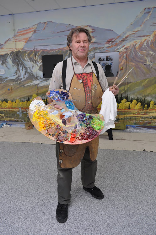
Clever Pallet!
I needed a pallet with a large mixing area and large enough to hold big globs of creamy artist oil colors while I stand on a ladder. To solve my need, I riveted metal paint pans side by side. It works great! Having the paint at my side is much handier than going up and down ladders each time I need to load my paintbrush. I think I might add one more thing---a handle on the right side to hang paint rags.
Balancing color harmony in painting
Mr. Hall felt that the MC Print sketch was too Yellow, especially the sky. My original intent was to create a morning light effect. I repainted the sky in the sketch and will try to get a photo of it next week. The truth is, I also felt it was too yellow or warm when I finished the sketch , but I left it as you see in the first photo above so as to avoid too much purple or too much blue---which the client especially does not like ( I also agree with that ). What the client wants is to help create an uplifting and inspiring atmosphere. He wants to wow the viewer as he walks into the building. The place needs a decorative face lift anyway---the plain white walls make the place look like a mental hospital and needs a little color. Some of the employees jokingly say it is a mental hospital!
As color theory goes, there must be a delicate and carefully orchestrated balance of Warm against Cool colors in order for the painting to have the right "Temperature". Yes, there is actually such a principle as "Color Temperature". The painting must always have the right balance of cool against warm colors and yet still have an overall warm quality about it if warm tones are more dominant. Dark against Light and degree of Color Intensity ( or Saturation ) from Neutral colors to a higher intensity must also come in to play to create beautiful subtleties and moodiness. Yes, it's more than just slapping on paint and much more complex than paint by number. All paint is mixed as I go and done by feel until I am able to create beautiful music with a brush.
As color theory goes, there must be a delicate and carefully orchestrated balance of Warm against Cool colors in order for the painting to have the right "Temperature". Yes, there is actually such a principle as "Color Temperature". The painting must always have the right balance of cool against warm colors and yet still have an overall warm quality about it if warm tones are more dominant. Dark against Light and degree of Color Intensity ( or Saturation ) from Neutral colors to a higher intensity must also come in to play to create beautiful subtleties and moodiness. Yes, it's more than just slapping on paint and much more complex than paint by number. All paint is mixed as I go and done by feel until I am able to create beautiful music with a brush.
Friday, January 21, 2011
Making a Change
After painting in the mountain area, the following day I determined to raise the foothills on the right side. As they were, they looked like I could just swing my leg and step over them. The foothills were too much at eye level, so raising them made them feel a little taller. By the end of the day, I had the whole mural area blocked in.
Wednesday, January 19, 2011
Painting the Novatek MC Print Mural
Well, we started painting the basic undertones for the purpose of covering the white areas and placing key colors in areas which will influence the colors painted on top. In spite of a few interruptions today, we accomplished quite a bit. My goal is to have the background colors blocked in before the end of the week, then I paint on the Mountain Vista Mural in the morning then the MC Print Mural in the afternoon to evening. The idea is to hit two birds with one stone and cut down on my travel time to and from the mural projects.
I sort of invented a handy artist's pallet to use while I'm up on ladders painting away. I riveted 3 metal paint trays side by side. The two from left to middle holds large globs of paint. The one on the right is mainly used for mixing. I also have mixing area in the other two trays if I need it. I riveted a handy metal handle on the underneath side of the middle tray also, so I can hold onto the pallet. It works great! I'll try to take a picture of my handy pallet tomorrow.
I sort of invented a handy artist's pallet to use while I'm up on ladders painting away. I riveted 3 metal paint trays side by side. The two from left to middle holds large globs of paint. The one on the right is mainly used for mixing. I also have mixing area in the other two trays if I need it. I riveted a handy metal handle on the underneath side of the middle tray also, so I can hold onto the pallet. It works great! I'll try to take a picture of my handy pallet tomorrow.
Subscribe to:
Posts (Atom)